A wealth management platform designed around a simple idea: investing should feel effortless.Because wealth should support your life, not become your life. More of this case study coming soon.
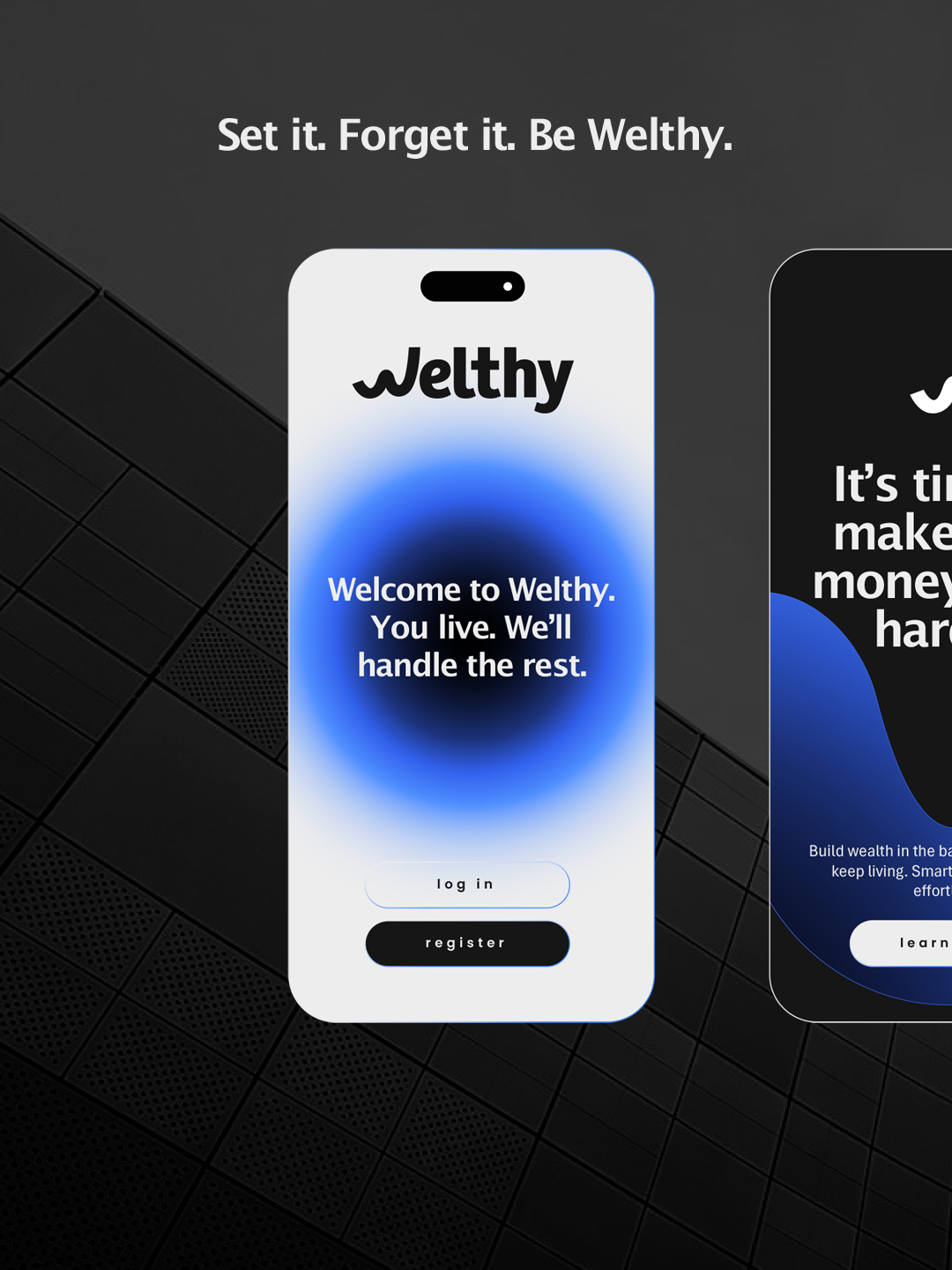
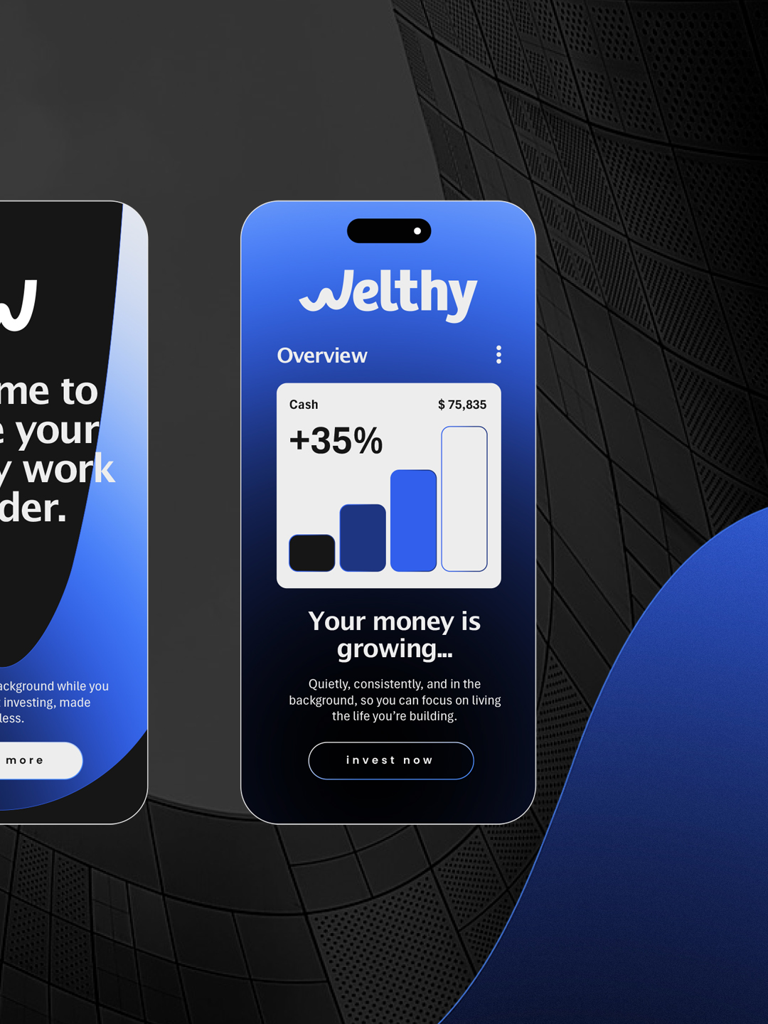
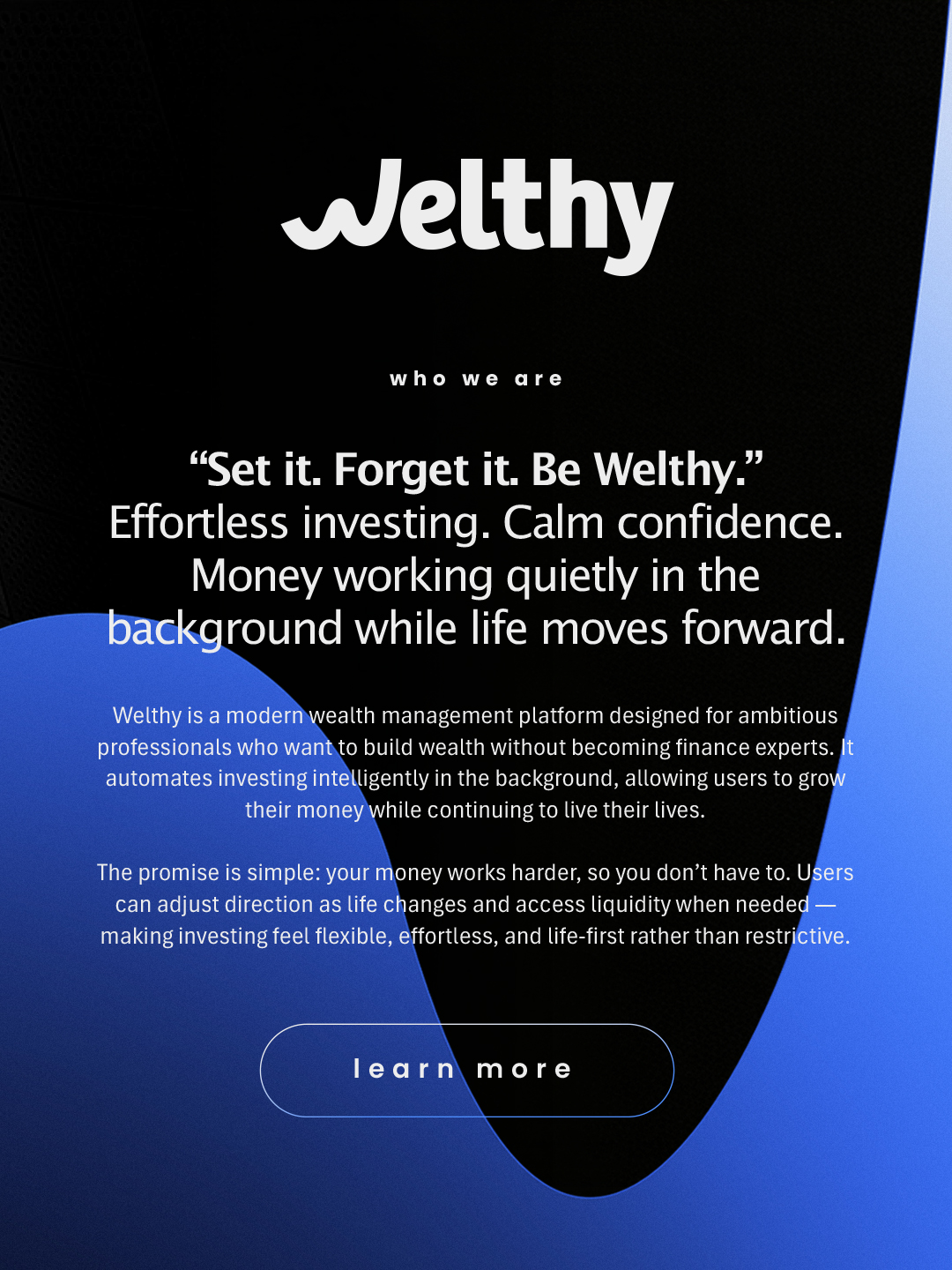
Rather than adding complexity, Welthy removes it. Automated investing, clear decision-making, and a flexible system that works quietly in the background while life moves forward.
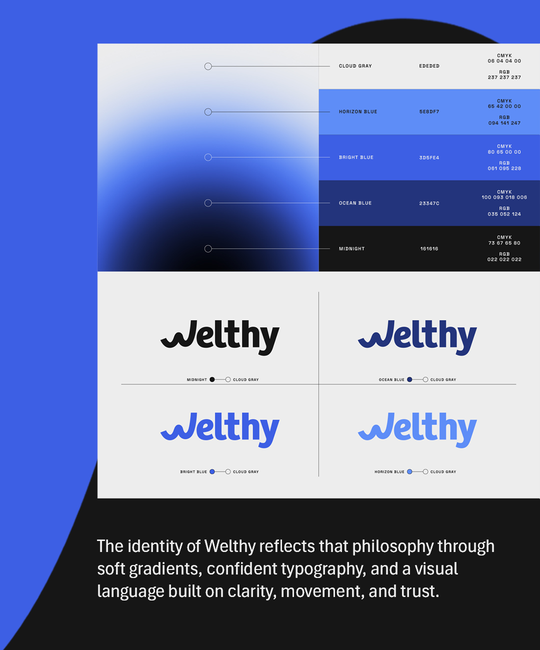
The identity of Welthy reflects that philosophy through soft gradients, confident typography, and a visual language built on clarity, movement, and trust.
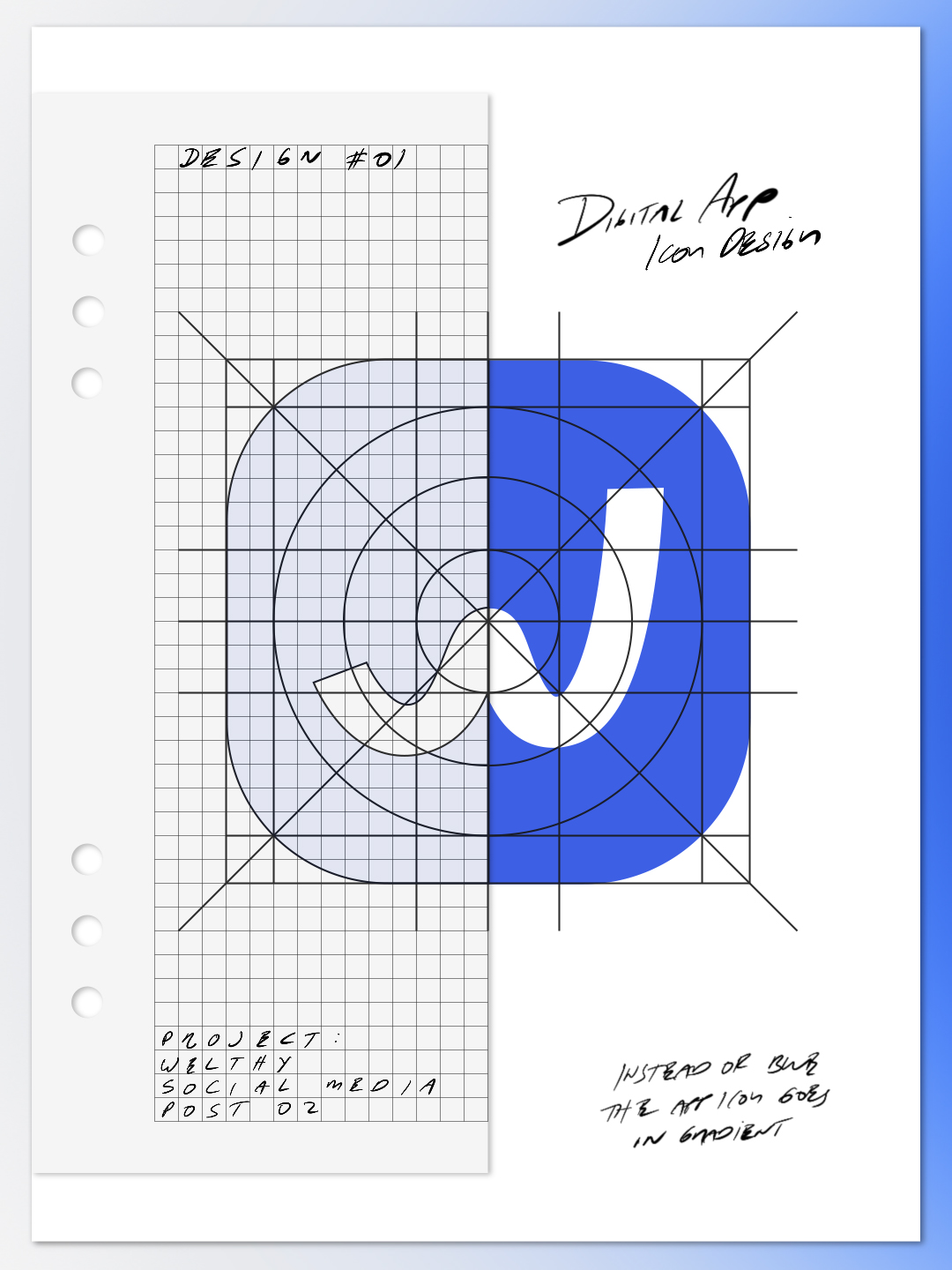
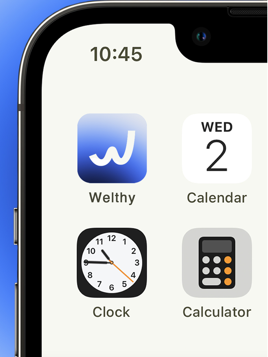
While developing the brand, we knew the icon had to do a lot more than simply represent the letter “W.” We wanted it to feel familiar, friendly, professional, original, and approachable. We needed it to be a recognizable symbol that people could trust and interact with every day.
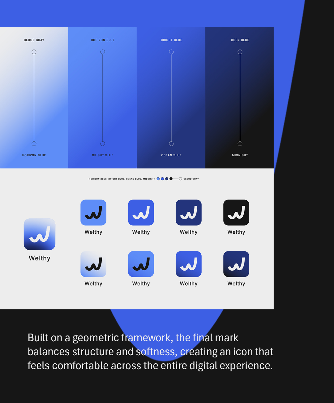
Built on a geometric framework, the final mark balances structure and softness, creating an icon that feels comfortable across the entire digital experience.
For Welthy, we developed a visual identity centered around clarity, confidence, and simplicity. From the color palette and gradients to the app icon and logo variations, every element was designed to feel connected, creating a flexible system that adapts seamlessly across every digital touchpoint.
A brand is more than a logo. It’s a system of elements working together to create a consistent experience.