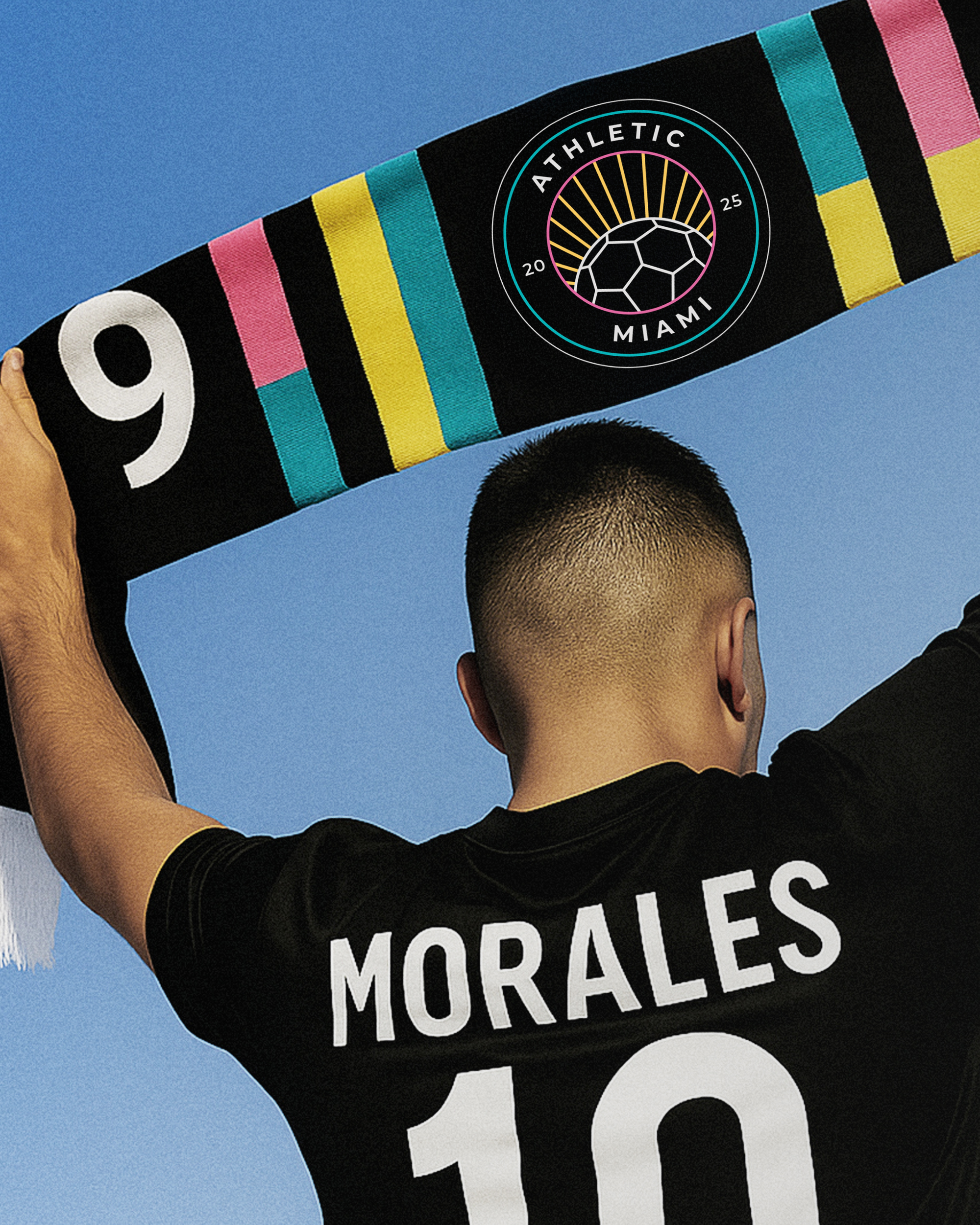
Introducing the brand identity for Athletic Miami. Built from the ground up, inspired by the city's rhythm and energy.
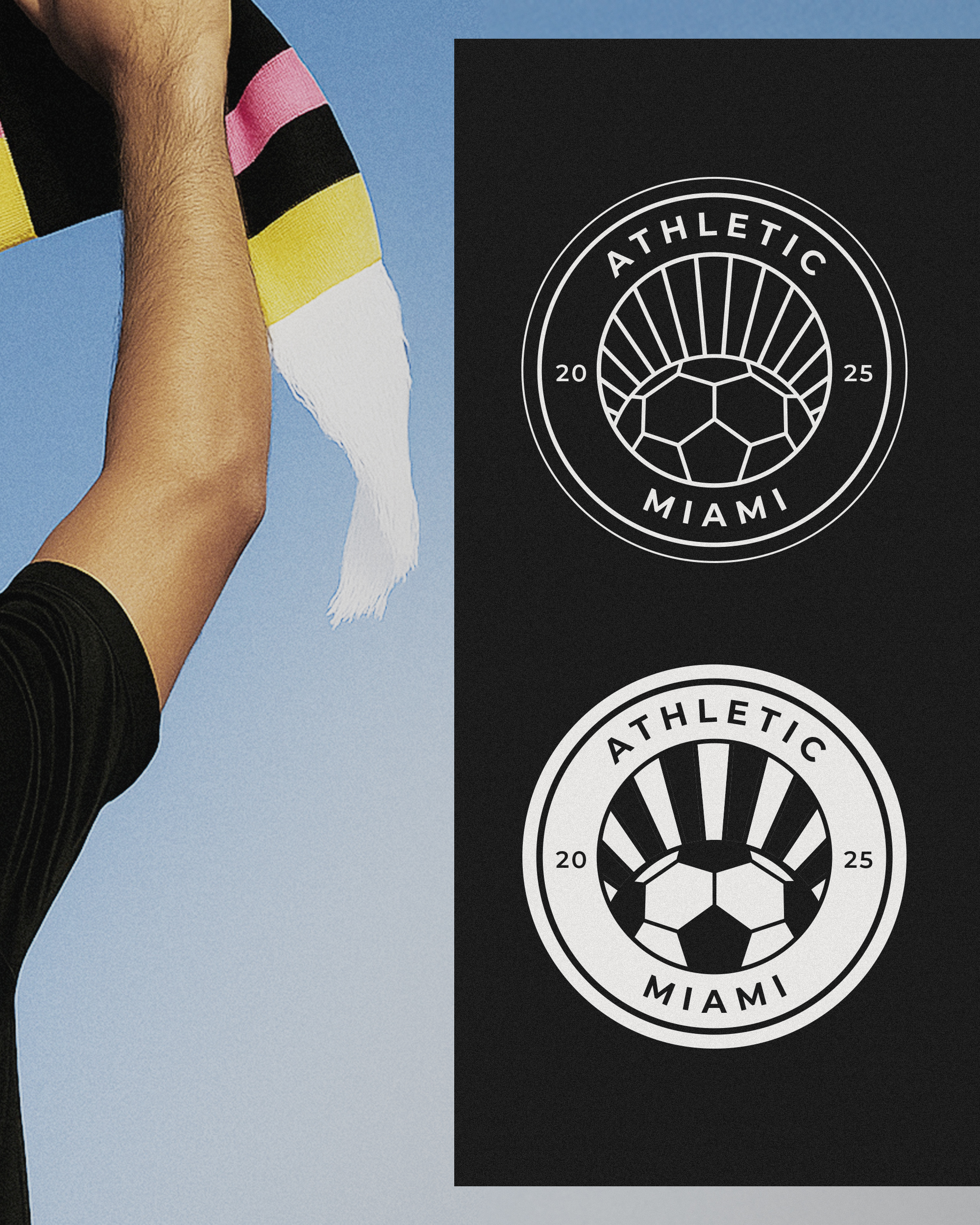
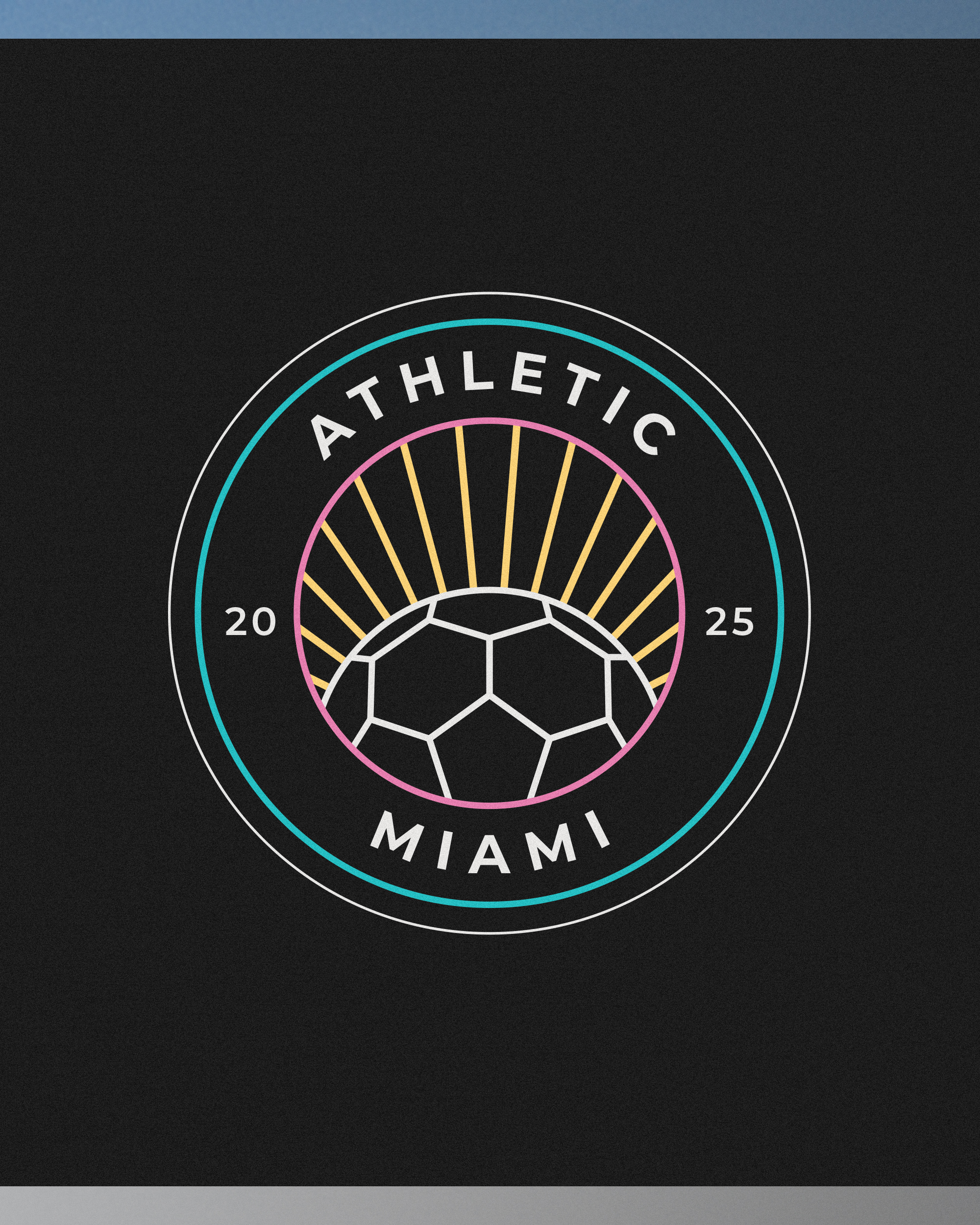
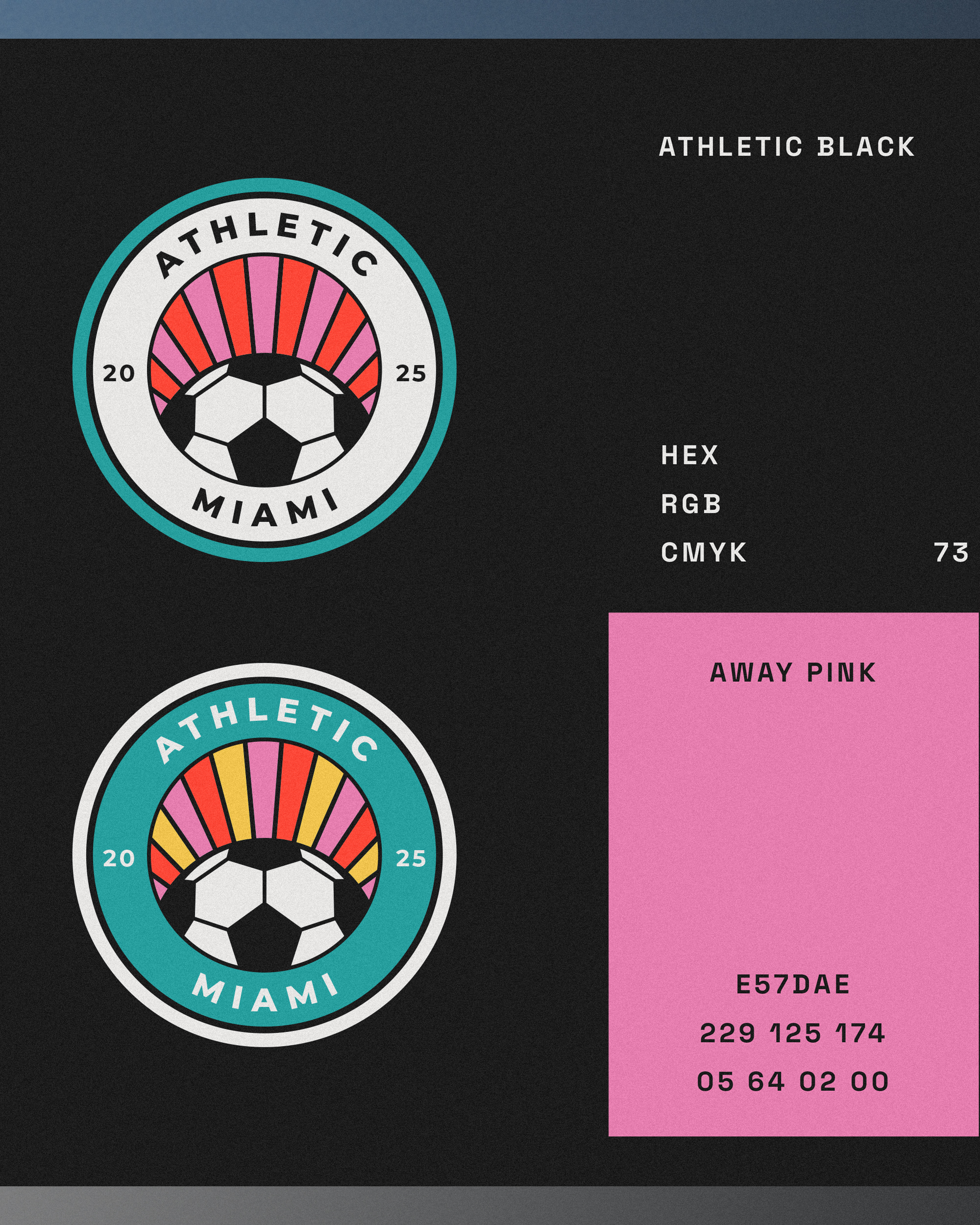
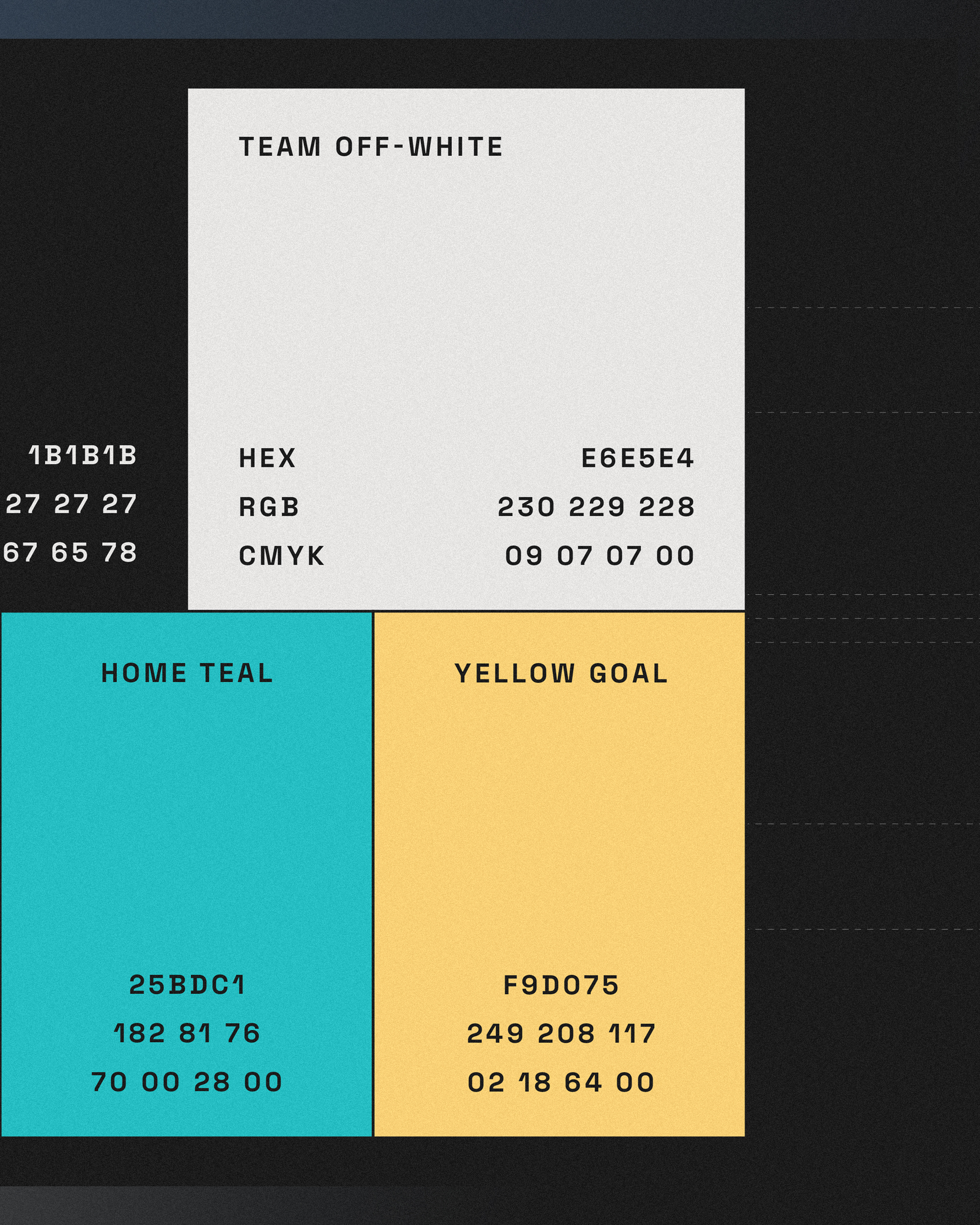
The logo for Athletic Miami hits all the right notes. The color palette, inspired by a pastel Miami Vice aesthetic, with pink, yellow, and teal tones set against a deep black background, feels both modern and unmistakably local. It’s energetic, fresh, and instantly places the brand within the vibrant culture of the city.
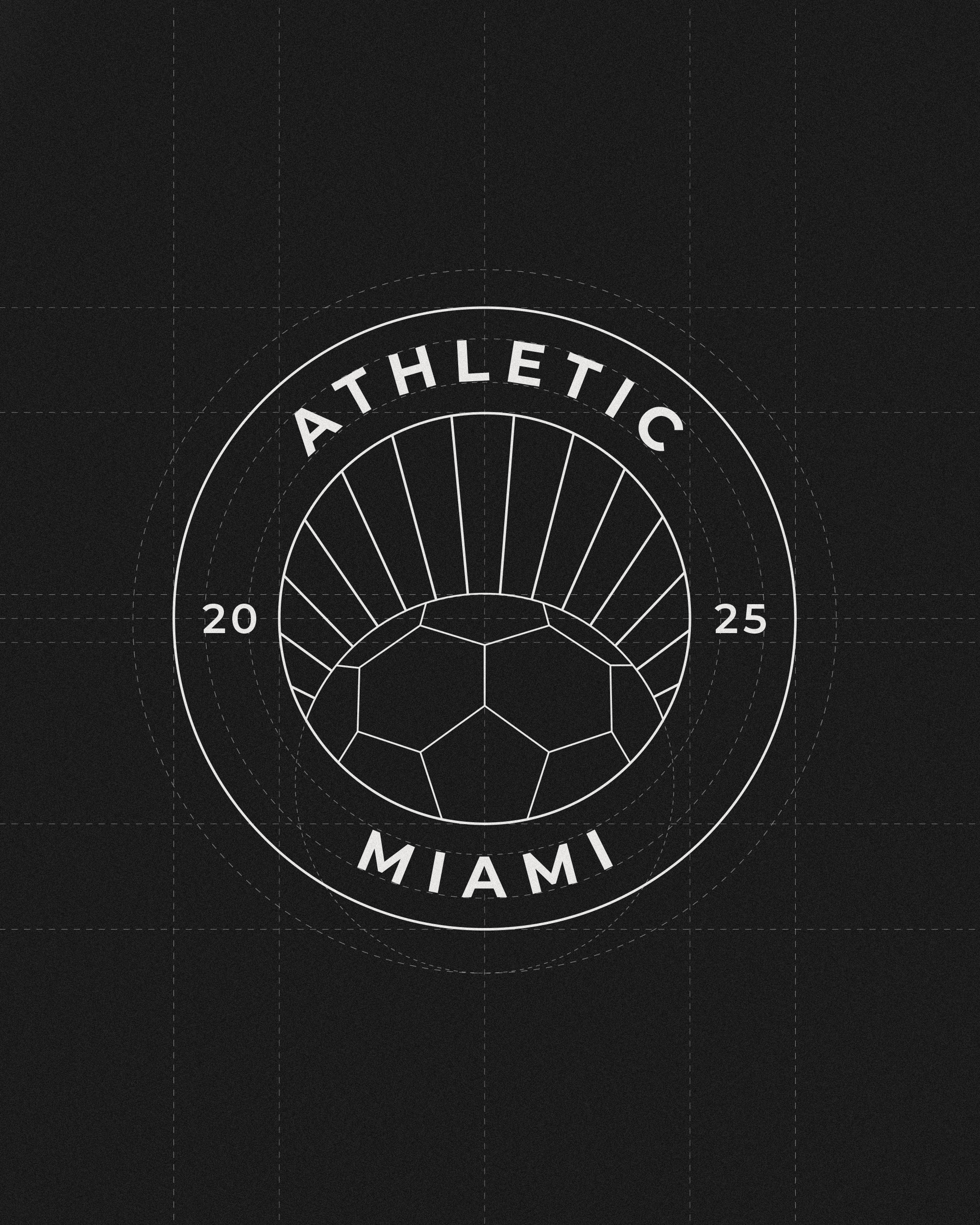
The sunburst element is a particularly smart touch. It acts as a metaphor for Miami’s iconic sunrises and heat, while also evoking the rhythm and momentum of the sport itself. It adds a sense of movement and ambition to the mark—almost like the team is always rising.
The integration of the soccer ball with the sun is subtle and elegant. It doesn’t feel forced or decorative; instead, it’s fully embedded into the design language of the badge, which makes the whole identity feel cohesive and intentional.
The typography choice brings everything together. It's modern, minimal, and bold—balanced neatly within the circle. It feels precise and editorial, which aligns beautifully with your signature style and attention to structure and geometry.